


Configure the React SimpleMDE Markdown Editor to allow for image upload by drag-and-drop and copy-and-paste


Quick Summary
In this tutorial, I will guide you on how to configure React SimpleMDE (EasyMDE) Markdown Editor to support Image upload through Drag and Drop & Copy and Paste feature. The project will be built using Nextjs and Typescript, Cloudinary would be used for image uploads.
Prerequisite
Node.js version >=
12.x.xinstalled on your local machine.Knowledge of Reactjs or Nextjs and Typescript.
Ensure that npm or yarn is also installed as the package manager.
React SimpleMDE (EasyMDE)
React SimpleMDE is a react component wrapper for EasyMDE, which is a JavaScript text area that allows you to write visually appealing and understandable Markdown. This editor is the perfect definition of WYSIWYG (What You See Is What You Get ); while editing, the syntax is rendered to clearly show the expected result.
When creating a personal blog or a project that uses markdown, one element to consider is how customizable or adaptable your chosen markdown is, because you'll most likely have preferences in terms of features, toolbar buttons, theme, and so on. EasyMDE includes loads of features and every option is customizable!
Let's get started
Get started by cloning the starter branch of the repo here.
To clone a specific branch of a git repository, follow the syntax:
git clone --branch <branchname> <remote-repo-url>
So in our case, run the code block:
git clone --branch starter https://github.com/Giftea/markdown-editor-project.git
Next we import the editor from react-simplemde-editor and create a new component.
import React, { useState } from "react";
import SimpleMDEditor from "react-simplemde-editor";
import "easymde/dist/easymde.min.css";

const Editor = () => {
  const [value, setValue] = useState("");

  const onChange = (value: string) => {
    setValue(value);
  };

  return <SimpleMDEditor
            id="editor"
            value={value}
            onChange={onChange}
            />;
};

export default Editor;
The editor should look like this on your localhost.

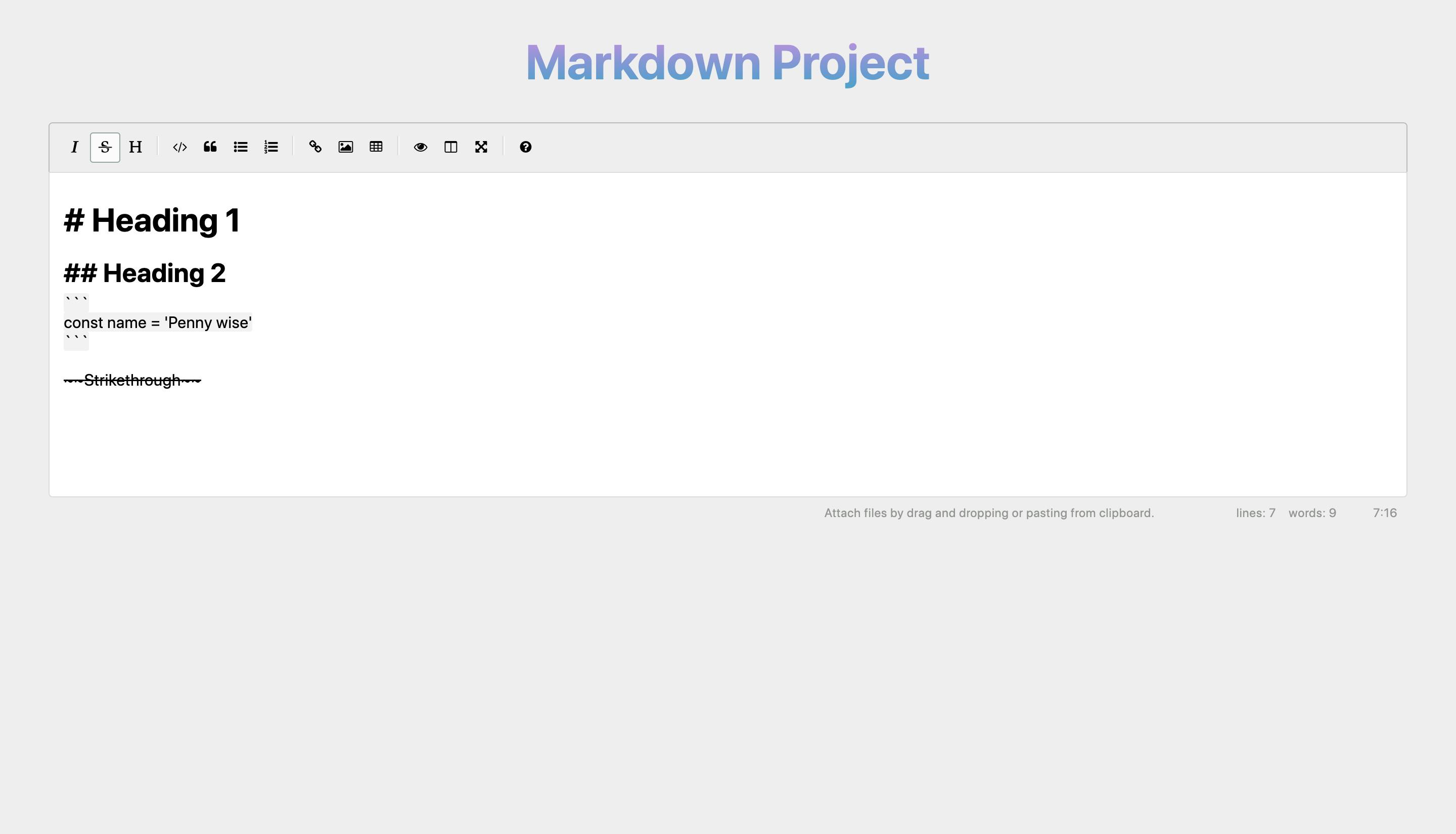
You can explore the default editor by writing a little paragraph and testing out the function of each toolbar button. EasyMDE makes it possible for people who aren't familiar with Markdown to use familiar toolbar buttons and shortcuts.
If you've played around with the editor, you've probably noticed that clicking the image icon on the toolbar displays an image markdown syntax .
This is inconvenient since it requires you to upload an image to a server manually and then paste the image URL into the markdown image syntax before it can be loaded and previewed on the editor. I am currently writing this article on Hashnode's markdown editor, and I didn't have to go through the trouble of uploading an image to an external server.
Let's inspect the editor component... 🙃
  return <SimpleMDEditor
            id="editor"
            value={value}
            onChange={onChange}
            />;
As you can see in the code block above, SimpleMDEditor component takes in three props: id, value and onChange.
id: The id of the component.value: The value of the component.onChange: A function to update the value of the component, so we have a controlled component.
Our component is not restricted to these three props, there are six other optional props.
export interface SimpleMdeReactProps
  extends Omit<React.HTMLAttributes<HTMLDivElement>, "onChange"> {
  id?: string;
  onChange?: (value: string) => void;
  value?: string;
  extraKeys?: KeyMap;
  options?: SimpleMDE.Options;
  events?: SimpleMdeToCodemirrorEvents;
  getMdeInstance?: (instance: SimpleMDE) => void;
  getCodemirrorInstance?: (codemirror: Editor) => void;
  getLineAndCursor?: (position: Position) => void;
}
extraKeys: This is used to include key maps; key maps are ways of assigning specific functions to keys and mouse buttons. A key map is a data structure that maps strings that identify buttons to functions that perform their duties.options: This used to customize different features of the editor, such as: toolbar, auto-save, spell checking, image upload, auto-focus, shortcuts, error messages, status, theme, etc. To find out all theoptionslist and how you can configure each, visit the docs.events: Events are actions or occurrences that occur in the system you're developing and are reported to you so that your code can react. For example, the click of a button is an event and the event listener associated with the button handles the response to theclickevent. Theeventsprops is used to add event listeners for events of the CodeMirror.getMdeInstance: This is a function used to retrieve and modify easymde information.getCodemirrorInstance: This is a function used to retrieve and modify codemirror information.getLineAndCursor: This is a function used to retrieve and modify cursor information.
Now that we've learned about all nine props, we'll focus on the options prop and how to use it to enable picture uploading.
Options prop
Let's quickly customize some features on the options props.
const newOptions = useMemo(() => {
    return {
      spellChecker: false,
      showIcons: ["strikethrough", "table", "code"],
      hideIcons: ["bold"],
    };
  }, []);
In the above configuration, spellChecker is set to false , but the editor sets it to true by default. Also we added additional icons to the toolbar with the showIcons option and hid an icon with the hideIcons option.
     <SimpleMDEditor
      id="editor"
      value={value}
      onChange={onChange}
      // Add the options prop
      options={newOptions}
    />
Voila! New toolbar buttons!
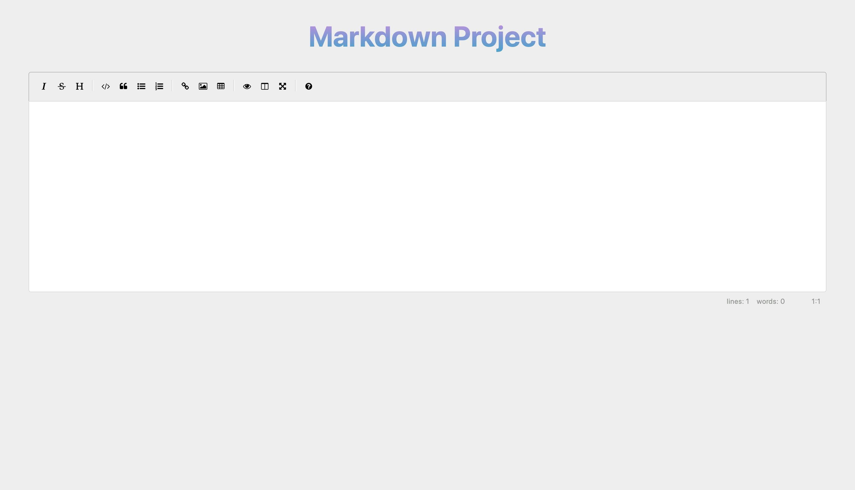
Image upload option
To enable image uploads, we have to add two new extra options; one is a boolean and the other a function.
const newOptions = useMemo(() => {
    return {
      spellChecker: false,
      showIcons: ["strikethrough", "table", "code"],
      hideIcons: ["bold"],
      // New options
      uploadImage: true,
      imageUploadFunction: imageUpload,
    };
  }, []);
Let's quickly create imageUpload function above newOptions.
type ImageUploadType = {
   (image: File,
   onSuccess: (url: string) => void,
   onError: (errorMessage: string) => void) : void
}

  const imageUpload: ImageUploadType = async (image, onSuccess, onError) => {
    try {
        onSuccess()
    } catch (error) {
      return onError()
    }
  }
From the code block above, imageUpload function takes in three parameters:
imageFile; the image to upload, as a HTML5 File object.onSuccess; A callback function to execute after the image has been successfully uploaded, with one parameterurl(string): The URL of the uploaded image.onError; A callback function to execute when the image upload fails, with one parametererror(string): error message to display to the user.
The image url is passed as a parameter into the onSuccess callback function after it has been uploaded to a server. The images will be uploaded to cloudinary for this tutorial, but if you have a different server or other preferences, upload the image, retrieve the image url, and skip the cloudinary step below.
Cloudinary
Cloudinary is a full-service image and video management solution for websites and mobile apps that handles everything from image and video uploads to storage, manipulations, and finally delivery.
- Create a free account with cloudinary here.
- After creating your account navigate to settings.
- Under the Account tab you can change your cloudinary cloud name (optional).
- Still under settings, navigate to the Uploads tab and scroll down to Upload presets settings.
- Add new upload preset and change the signing mode to unsigned.
All done with cloudinary set up
Let's head on to upload image to cloudinary and retrieve the image url.
const imageUpload:ImageUploadType  = async (image, onSuccess, onError) => {

    try {
      const data = new FormData();
      data.append('file', image);
      // replace 'giftea' with your upload preset name, don't use mine lol
      data.append('upload_preset', 'giftea');
      // in the cloudinary end point, replace 'gifteacloud' with your cloudinary name
      const res = await axios.post('https://api.cloudinary.com/v1_1/gifteacloud/image/upload', data);
      const { secure_url } = res.data;
      onSuccess(secure_url)
    } catch (error) {
        console.error(error)
    }
  }
Now, when an image is dragged and dropped on the editor, or copied and pasted on the editor, it is automatically uploaded to cloudinary, and the returned image URL is added to an image markdown syntax.
Upload some pictures by dragging and dropping or copying and pasting them. Remember to use your cloudinary name and upload preset name because I will change the names I used in the code example.
Note
If you're using a different server other than Cloudinary, remember to add the retrieved image URL as a parameter in onSuccess function.
Bonus
We've added a cool feature to the editor, but there's one more thing to do. Let's make the image button in the toolbar open the user's local file explorer when clicked. We'd have to hide the image icon and show the upload-image icon to accomplish this.
const newOptions = useMemo(() => {
    return {
      spellChecker: false,
      // hide image icon and show upload-image icon
      showIcons: ["strikethrough", "table", "code", "upload-image"],
      hideIcons: ["bold", "image"],
      uploadImage: true,
      imageUploadFunction: imageUpload,
    };
  }, []);
I hope I was able to help 🤗